Photographer
Photographer
Hannah Sorrell

Hallaien 2024

Description

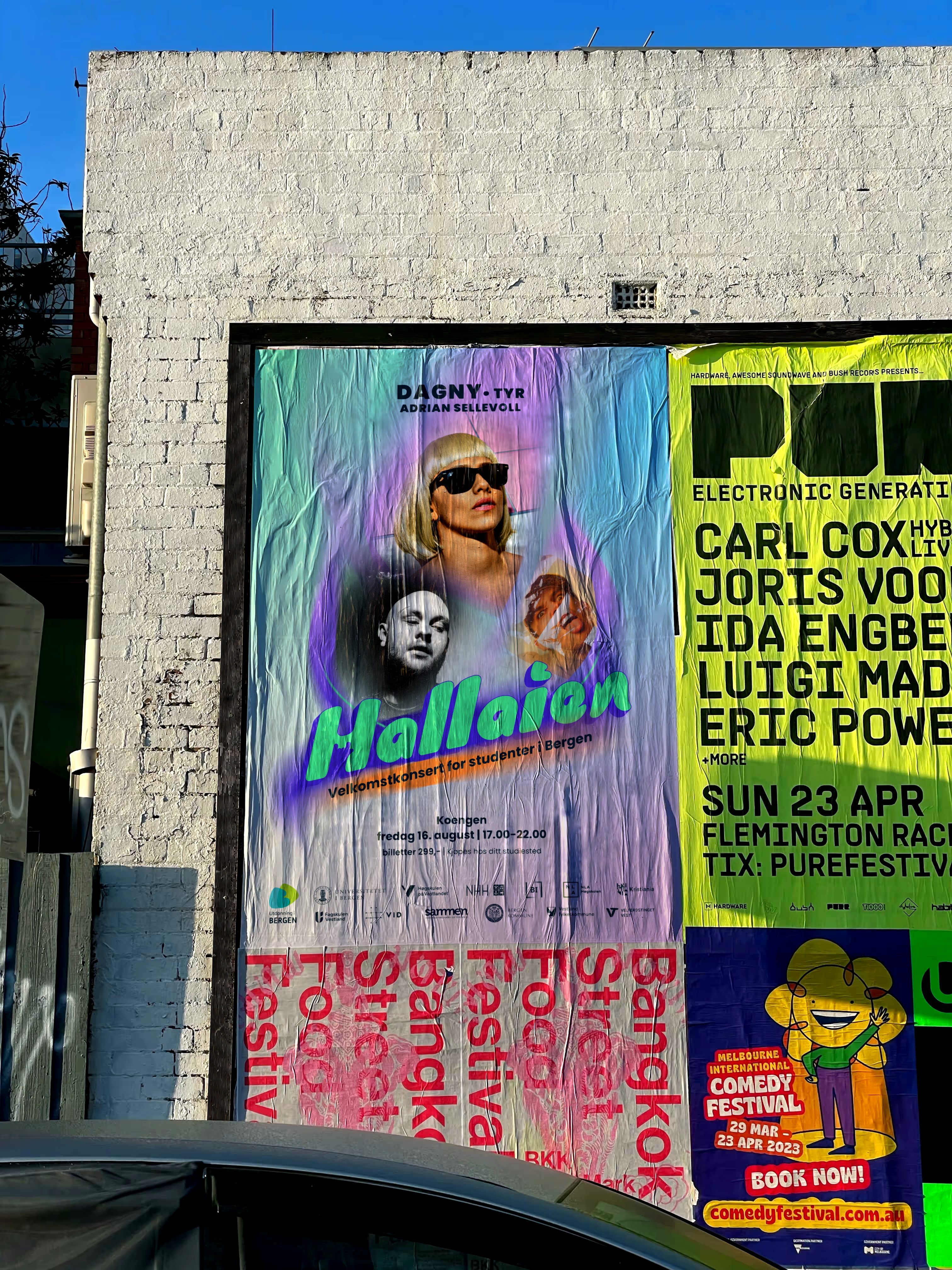
Hallaien is one of the biggest events for students in Bergen which is organized by Study Bergen and Bergen Festival. This concert held at the start of every academic year in Bergen and invites all students to come, celebrate, and socialize with their peers from all universities and institutions in Bergen.

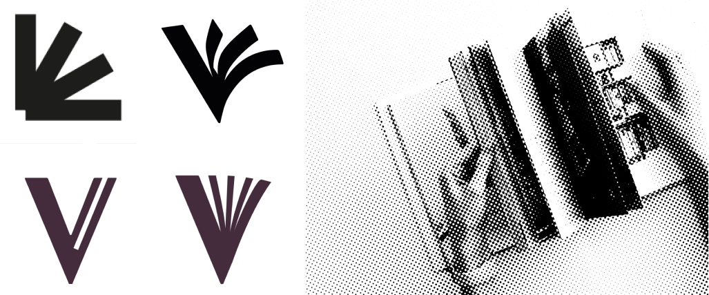
Study Bergen needed a new visual identity for Hallaien concert that long lasts and communicates the feeling of excitements and celebration. The word “Hallaien” means “Hi” in Bergen dialect and the concert’s mission is to give a warm welcome to students in Bergen.

TIMEFRAME
May-April 2024
[59 hours]
Discipline
Animation
Brand Identity
tools
After Effects
Illustrator

Challenges/ Expectations

“The new identity shouldn’t promote only one or two institution and organization by using similar color codes or common signs*. The new logo should stand bold, loud and timeless.”
*In total 12 organizations, institutions, and universities in Bergen support this event.

- To “What” and “How” the Study Bergen team associated Hallaien -

Almost 63% of students weren’t familiar with the meaning of Hallaien.
- We randomly asked students in Fantoft student housing -
Discovery
The first step for designing MVP was to align with the team’s vision and understand their plans for this product. Defining the project’s goal statement helped us understand the key values of this product for its user groups, including students, recent graduates, and companies or businesses.
Goal Statement > Employers in Vestland region
Karrierekatapult will help employers to find the right candidate for executing their ongoing projects which will affect how they present their future open positions to new graduated students by giving them the ability to introduce the company to the potential candidates at Karrierekatapult. We will measure effectiveness by the number of graduated students who stayed in Bergen after their studies.
Goal Statement > Students and recent graduates
Karrierekatapult will enable students and recent graduates to discover potential job opportunities, which will affect how they connect with companies offering future positions. By linking them to companies in Bergen with relevant openings, the platform aims to strengthen local career connections. We will measure effectiveness by the number of graduates who secure relevant positions in Bergen after their studies.
Heuristic Evaluation

To efficiently continue improving the website in the absence of sufficient resources for conducting user test with actionable feedback, we conducted a heuristic evaluation. This expert review, enabled us to quickly identify usability issues and design inconsistencies.

After completing individual heuristic evaluations, our team came together to combine findings using a virtual board. By clustering similar issues and discussing areas of agreement and divergence, we identified the most critical usability problems.

Synthesizing the issues on a virtual board before clustering and prioritizing the issues.
Key Findings

We identified several usability issues that could significantly impact the performance and user experience of our platform. Below, we have outlined some of the most critical problems along with the suggestions from our team members.

😥 Issue:

The website has oversized event cards with limited information; they lacked supporting visual elements. It made the content less engaging, especially on smaller screens.

🤔 Solution:

Designing optimized event cards that combine visual elements and concise text to effectively convey key information about each event.

Recognition Rather Than Recall

Does the design keep important information visible, so that users do not have to memorize it?

😥 Issue:

In the small screens in the langing page, the hero section is too large and is not helpful. we have to scroll down to find the arrangements.

🤔 Solution:

The most important content on the landing page should be easily discoverable, accessible, and take up optimised space.

Aesthetic and Minimalist Design

Interfaces should not contain information that is irrelevant or rarely needed.

😥 Issue:

No visible way out of the specific event or organisations (besides the menu and the breadcrumbs)

🤔 Solution:

1. Add “similar events or organisations” under the specific ones.
2. Add the button to go back to the full list of organisations or the calendar
3. Make it possible to restore the previous version

User Control and Freedom

Does the design allow users togo back a step in the process?

Secondary Research

We started with secondary research on similar websites such as SiO and Samfundet to identify best practices and uncover areas for improvement. It helped us to understand established conventions and apply those solutions.

A table of common features found on event pages across different platforms.
To create a timeless icon for the Halllaien concert that embodies youth, excitement, and enthusiasm, we considered the following design elements and concepts:
Click on the tabs to see the process!
With incorporating dynamic and fluid shapes I tried to convey movement and energy. Shapes such as swirls, waves, or geometric designs.
Here are the concepts I started the process with...
By Integrating symbols that are associated with concert and music, such as musical notes and silhouettes of hands, tried to capture the essence of a music festival.The aim was to symbolize the liveliness and enthusiasm of the concert atmosphere and its audience energy.
Since these annual concerts are strongly integrated with Bergen’s culture and history [from the name of the concert to the location of the event] I also experimented with the iconic characteristics of this city. With suggesting playful typefaces and combining it with traditional handwritten fonts, we were getting close to our desired modern logo.
Used alternative palettes of bright, bold colors that evoke energy and excitement with considering colors like electric blue, neon green, pastel purple, and vibrant orange.
Midnight
Hex: 002236
RGB: 0, 34, 54
CMYK: 100, 63, 16, 78
Pantone: 2965 C
Aqua Marine
Hex: 4FF0A3
RGB: 79, 240, 163
CMYK: 70, 0, 65, 0
Pantone: 2412 C
Lilac
Hex: CEA2FD
RGB: 206, 162, 253
Turquoise Blue
Hex: 68D8FF
RGB: 104, 216, 255
Silver
Hex: F3F3F3
RGB: 243, 243, 243
Pastel Orange
Hex: FF9447
RGB: 255, 148, 71
Purple Blue
Hex: 4830D6
RGB: 72, 48, 214
The story board helped translate written ideas and scripts into a visual format, outline the sequence of events, showing how scenes transition and how the story progresses visually.
Next step was designing the characters to align with their purpose in the narrative, determining the characters' physical features, including shape, proportions, clothing, colors, and distinct details.
The primary colors resonate with the Dayan Group brand palette, ensuring consistency with its identity. To enhance the visual appeal and versatility of the motion graphic, additional colors were introduced. These supplementary hues were carefully selected to balance the palette, providing a cohesive yet dynamic range that aligns with the energetic and professional tone of the motion graphic.
Color 001
599CF8
Color 002
82C4F7
Color 003
4B63B9
Color 004
C1E1FC
Color 005
4EDCC5
Color 006
FEC0C9
Color 007
FFB446
Color 007
FFB446
Color 007
FFB446
Color 007
FFB446
Color 007
FFB446
Color 007
FFB446
Color 007
FFB446
Using 60-30-10 rule to o create visually harmonious and balanced color palettes. This principle helped distributing colors proportionally within a design to ensure it looks cohesive and appealing.
This diagram served as the primary inspiration for our project. By integrating its elements, we ensured that the final solution effectively reflects the project's core concepts.
In the first sketches, more general concepts such as cooperation and consensus were considered. Gradually, the concepts came closer to the idea of the goddess Temis as a wise consultant.
For the typography, inspiration came from ancient Greek and Roman lettering. Then a cohesive theme around them was developed. To maintain a modern and minimal aesthetic, I simplified the design by eliminating intricate details and employing repetitive elements throughout the typography.
With incorporating elements from the Faculty of Social Sciences’ historical background with a modern twist, designing clean fonts with good readability. A mix of serif (for tradition) and sans-serif (for modernity) typefaces.
Integrating dynamic lines and wave-like shapes to represent the motion of flipping pages, clean and simple lines to give it a modern and elegant appearance.
By keeping the previous typeface of the magazine, refining and adapting it to the new design, ensured the brand recognition and connection to the previous logo.
An icon derived from the full logotype was essential for maintaining a recognizable brand presence across various platforms. The most distinctive parts of the full logotype are “S” from “Sam” [Together] and “V” from “Viten” [Knowledge].The freeform elements ensured originality, while guidelines and geometric shapes refined the design.
To enhance the design, we incorporated a symbol representing elevation and propulsion, visually reinforcing the concept of growth and launching careers. This approach creates a dynamic and memorable identity while maintaining the core essence of the brand.
The name Karrierekatapult was simplified by breaking it into two parts: Karriere and Katapult, emphasizing clarity and readability. Considered a modern sans-serif fonts for a professional, approachable feel.
Among the primary colors, Iris Blue represents trust, stability, and professionalism, drawing inspiration from Bergen's fjord heritage. Smoke White and Midnight Blue provide balance and contrast, creating a harmonious foundation. The palette is complemented by a vibrant and energetic accent palette.
Iris
Hex: #4830D6
RGB: 72, 48, 214
CMYK: 99, 96, 0, 0
Smoke White
Hex: F3F3F3
RGB: 243, 243, 243
CMYK: 0, 0, 0, 5
Midnight Blue
Hex: #002236
RGB: 0, 34, 54
CMYK: 100, 90, 51, 60
Lilac
Hex: #CEA2FD
RGB: 206, 162, 253
Eucalyptus
Hex: F3F3F3
RGB: 243, 243, 243
Cyan
Hex: #68D8FF
RGB: 104, 216, 255
The previous logo's sharp corners, which distracted the visual focus, were rounded to simplify the design and transform it into an icon. A thicker stroke was introduced to enhance clarity, particularly at smaller dimensions, ensuring better readability for elderly users.
The color palette is a mixture of the brand’s context and the meaning of the Lotus. However, the main focus is on the patients' expectations of the dental clinic. The Medium Turquoise color and Heliotrope Purple is chosen as the primary color and the accent (refers to the Lotus plant) is a gradient of primary colors.
Primary Color 001
Medium Turquoise
Hex: #4DCEB7
RGB: 77, 206, 183
Primary Color 002
Heliotrope Purple
Hex: #DE53FD
RGB: 222, 83, 253

Accent 006
Hex:
#4DCEB7 - #DE53FD
Additional 003
Cherry Pie
Hex: #CEA2FD
Additional 004
Baltic Sea
Hex: #2B2B2B
Additional 005
Spring Wood
Hex: #F4F4F4
Structuring the platform
To identify the platform's key features, we analyzed competitors and determined the areas to focus on and improve. In the end the flowchart of the website's general structure was developed through the process.

Challenges/ Expectations

“The new identity shouldn’t promote only one or two institution and organization by using similar color codes or common signs*. The new logo should stand bold, loud and timeless.”
*In total 12 organizations, institutions, and universities in Bergen support this event.

- To “What” and “How” the Study Bergen team associated Hallaien -

Almost 63% of students weren’t familiar with the meaning of Hallaien.
- We randomly asked students in Fantoft student housing -
Wireframes
As part of my role, I used wireframes to explore the layout of the landing page. This approach allowed me to quickly map out user flows without dedicating excessive time to the visual design of the screens. During the initial stages, the primary focus was on positioning "DSD Clinic" and "All on 4 Clinic" prominently within the first-level navigation.
Prototyping

During the design process, we decided to skip the low-fidelity wireframing phase due to time constraints and the need to conserve resources. This decision was also supported by the nature of the feedback we had gathered from students and earlier evaluations. Most of the issues identified were related to usability and visual details, rather than structural or IA problems.

As a result, we moved directly into creating high-fidelity prototypes to address those specific concerns more efficiently and to allow for quicker iterations on visual design and user interaction.

StudentBergen.no homepage
Scenario 1

Per is a new student in Bergen who wants to explore the city’s student social life. While visiting Student Torget, he scans a Studentbergen.no QR code with his phone and opens the website. He is looking for an overview of activities, festivals, and events.

Task 1:
Exploring the events for students in Bergen on Studentbergen.no for the first time.

Key Feature:
Clearly presenting the event listings to new students in Bergen, with helpful information to distinguish different types of activities.

Justification:
Students reported not realizing that the “Read more” button in the hero section of the landing page led to the events page.

StudentBergen.no event page Figma prototype

Task 2:
Finding an event based on personal interest.

Key Feature:
Using the new filter system that allows users to choose a time period based on their personal schedule and filter events by activity categories.

StudentBergen.no event page, choosing a time period based on user's personal schedule and filter events by activity categories.

Task 3:
Comparing and selecting an event.

Key Feature:
Providing detailed event information — including date, time, ticket pricing, location, and related links — along with recommendations for similar events.

StudentBergen.no event page, choosing a time period based on user's personal schedule and filter events by activity categories.

Task 4:
Selecting an event to attend.

Key Feature:
Adding to calendar should be a one-click process, with correct formatting for different calendar platforms.

StudentBergen.no homepage
Scenario 2

Per enjoys open-door activities and wants to find organizations or clubs where he can regularly participate, connect with others, and meet students who share his interests.

Task 1:
Exploring organizations

Key Feature:

  • Provide a scrollable, space-efficient list of student organizations and clubs, enabling new students in Bergen to quickly browse and scan through all options. Optimized card sizing ensures better use of space and faster recognition.

Justification:

  • Experts mentioned that organizations' cards were unnecessarily big and the space could have been optimized for showing supportive text includes supplementary information that complements the heading.
StudentBergen.no organization page Figma prototype.

Task 2:
Find an organization based on user’s interest.

Key Feature:

  • To help users navigate the large number of organizations (225 total), we grouped them into listing cards based on shared categories.

Justification:

  • Grouping large sets of items into categories or card-based clusters is a well-established UX pattern. It’s a form of progressive disclosure, where we first show users a meaningful overview, then let them drill down into specific items. This approach improves scannability, reduces choice overload, helps users build a mental model of the available options, and speeds up the decision-making process.
StudentBergen.no organization page prototype, using card-based clusters to show an overview of all student organizations

Task 3:
Filter organizations by user’s university or institution for more relevant results.

Key Feature:

  • Using filter to deliver relevant and personalized results
StudentBergen.no organization page prototype and filter feature.